PARC: Contrast
Spotify
https://www.spotify.com/us/
Spotify is a good example of contrast, they make a good differentiation between the background and the fonts, using the color and fonts effectively allowing the user read the message without any complications.
Visual Herarchy
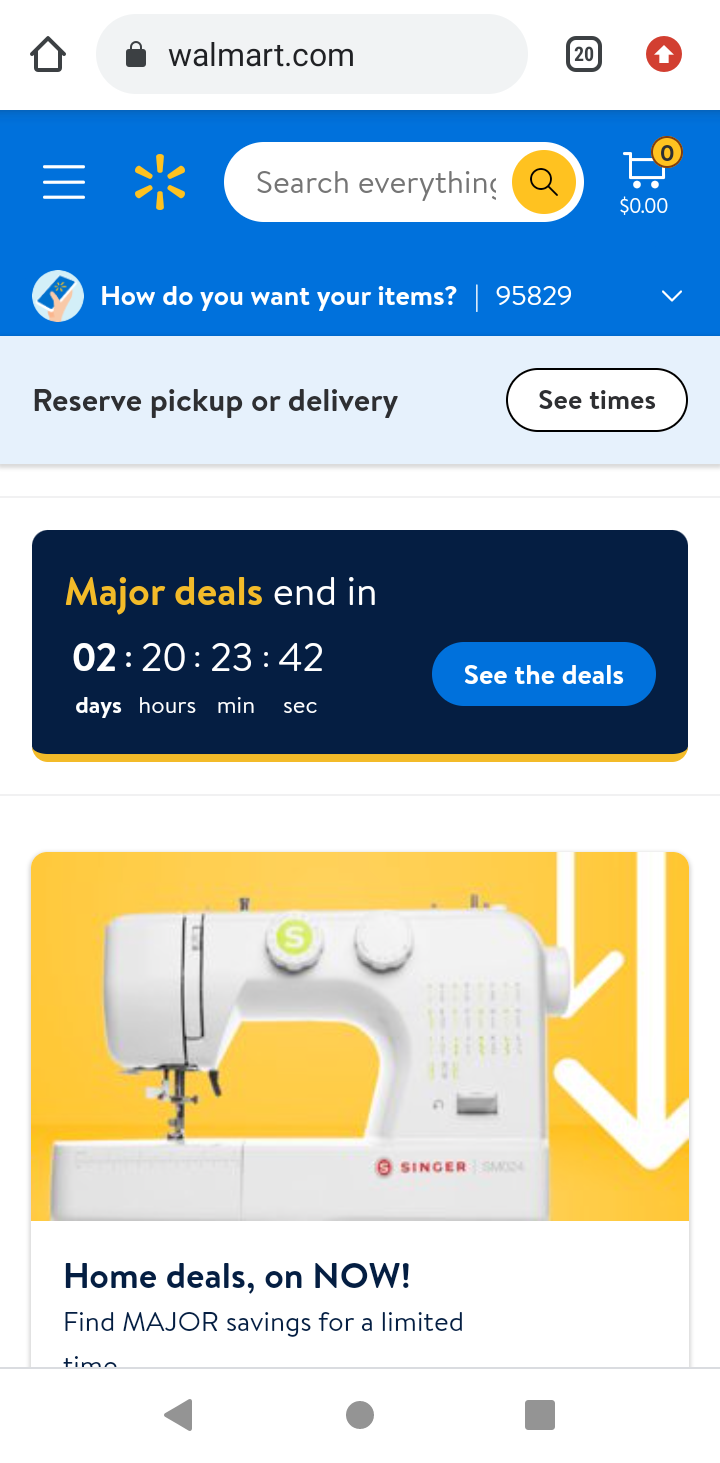
Walmart
https://www.walmart.com/
Walmart use visual Herarchy, because they ensures users find what they need. They use the Hero Section, which is meant to be the biggest and most visually striking section above the fold, the purpose of which is to draw the user's attention.
PARC: Proximity

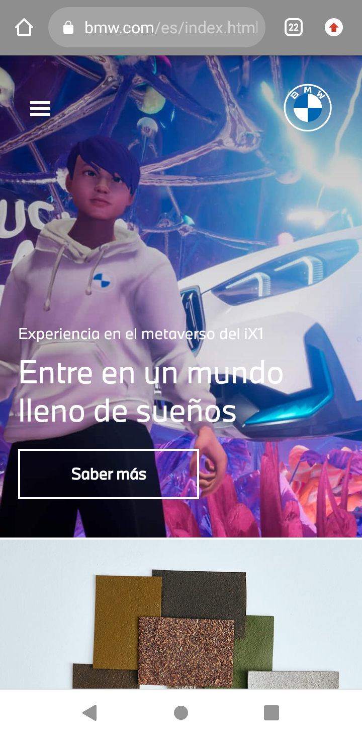
BMW applies PARC proximity in their design, placing elements close to each other to share a relationship in their message, which is the design and performance of their cars. The design of the site follows an organization in its elements that can be seen in the image gallery.