Introduction
CSS Grid Layout (aka “Grid” or “CSS Grid”), is a two-dimensional grid-based layout system that, compared to
any web layout system of the past, completely changes the way we design user interfaces. CSS has always been
used to layout our web pages, but it's never done a very good job of it. First, we used tables, then floats,
positioning and inline-block, but all of these methods were essentially hacks and left out a lot of important
functionality (vertical centering, for instance). Flexbox is also a very great layout tool, but its
one-directional flow has different use cases — and they actually work together quite well! Grid is the very
first CSS module created specifically to solve the layout problems we've all been hacking our way around for
as long as we've been making websites.
Basics and Browser Support
As of March 2017, most browsers shipped native, unprefixed support for CSS Grid: Chrome (including on
Android), Firefox, Safari (including on iOS), and Opera. Internet Explorer 10 and 11 on the other hand support
it, but it's an old implementation with an outdated syntax. The time to build with grid is now!
To get started you have to define a container element as a grid with display: grid, set the column and row
sizes with grid-template-columns and grid-template-rows, and then place its child elements into the grid with
grid-column and grid-row. Similarly to flexbox, the source order of the grid items doesn't matter. Your CSS
can place them in any order, which makes it super easy to rearrange your grid with media queries. Imagine
defining the layout of your entire page, and then completely rearranging it to accommodate a different screen
width all with only a couple lines of CSS. Grid is one of the most powerful CSS modules ever introduced.
Important Terminology
Grid Container
The element on which display: grid is applied. It's the direct parent of all the grid items. In this example
container is the grid container.
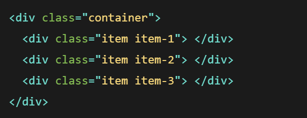
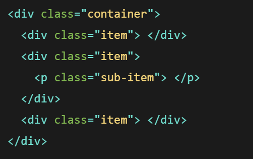
Grid Item
The children (i.e. direct descendants) of the grid container. Here the item elements are grid items, but
sub-item isn't.
Grid Line
The dividing lines that make up the structure of the grid. They can be either vertical (“column grid lines”)
or horizontal (“row grid lines”) and reside on either side of a row or column. Here the yellow line is an
example of a column grid line.

Grid Cell
The space between two adjacent row and two adjacent column grid lines. It's a single “unit” of the grid.
Here's the grid cell between row grid lines 1 and 2, and column grid lines 2 and 3.

Grid Track
The space between two adjacent grid lines. You can think of them as the columns or rows of the grid. Here's
the grid track between the second and third-row grid lines.

Grid Area
The total space surrounded by four grid lines. A grid area may be composed of any number of grid cells.
Here's the grid area between row grid lines 1 and 3, and column grid lines 1 and 3.

Grid Properties
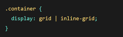
Display
Defines the element as a grid container and establishes a new grid formatting context for its contents.
Values:
- grid - Generates a block-level grid
- inline-grid - Generates an inline-level grid/li>
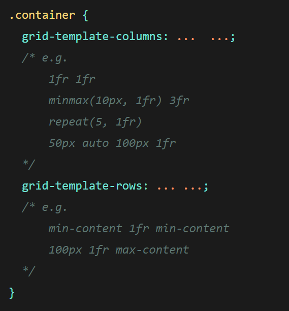
grid-template-columns / grid-template-rows
Defines the columns and rows of the grid with a space-separated list of values. The values represent the
track size, and the space between them represents the grid line.
- <track-size> - can be a length, a percentage, or a fraction of the free space in
the grid (using the fr unit)
- <line-name> - an arbitrary name of your choosing
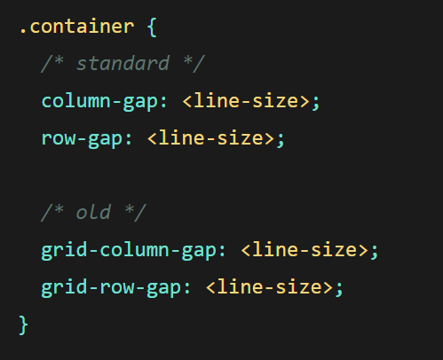
column-gap /row-gap
Specifies the size of the grid lines. You can think of it like setting the width of the gutters between the
columns/rows.
Values:
- <line-size> - a length value